New Identity
for a SaaS Product
Intro
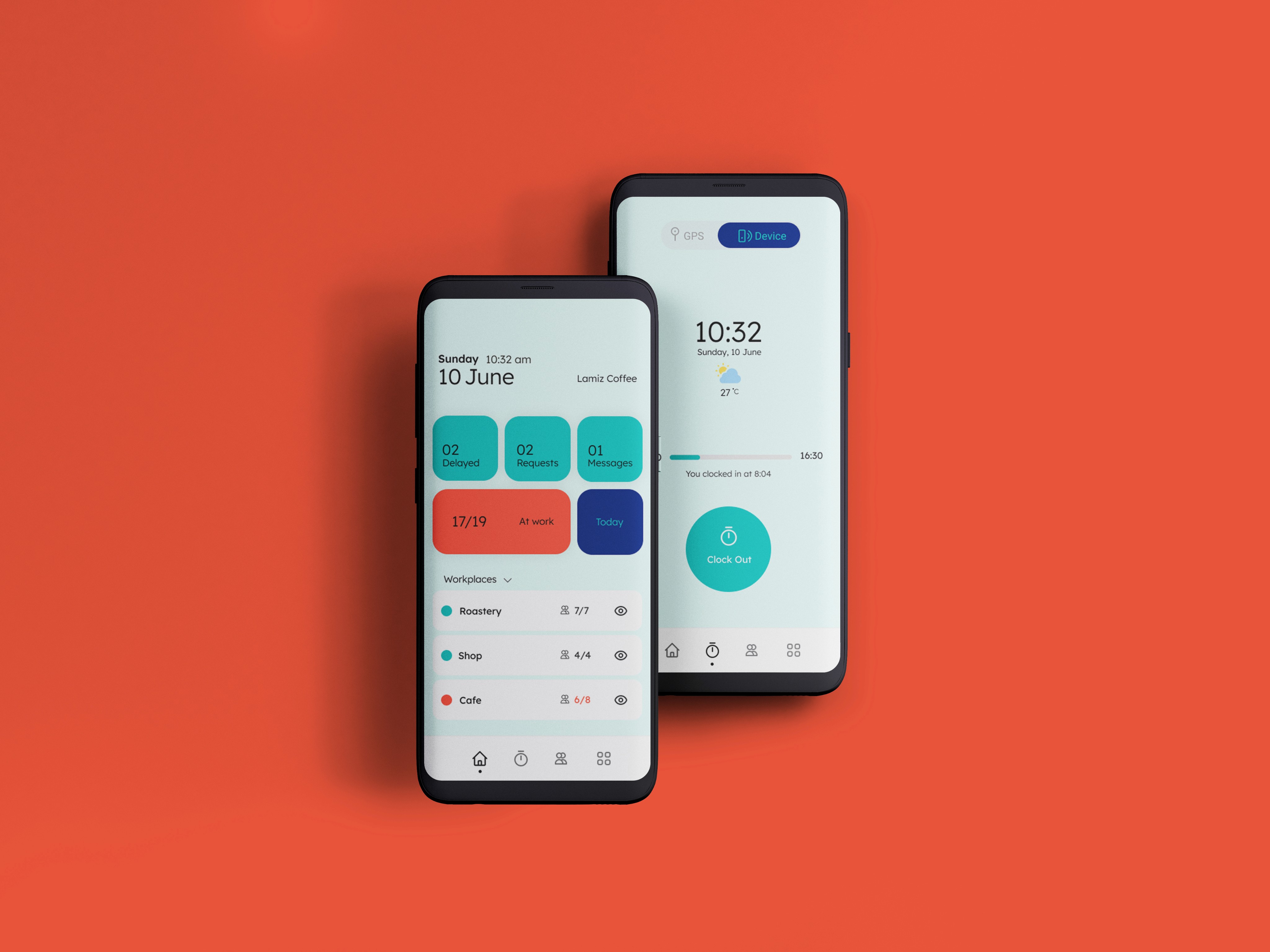
Ding is a cloud-based time attendance system for small-mid-sized businesses in Iran (mobile app + BT device).
In light of defining a new vision and value proposition, the company recognized the importance of redesigning their brand identity to align it closely with the emerging vision.
As the identity is set to be communicated through their product (mobile app) in the near future (3 months), the need for a cohesive and aligned brand identity translated through a Design System has become essential.
Challenge
Redesign brand identity aligned to the new vision.
Redesign mobile UI based on the new Identity.
Develop a design system a to ensure consistency in the future developments .
Role
As the Visual Designer I took care of the whole process by:
Art direction
Design Strategy
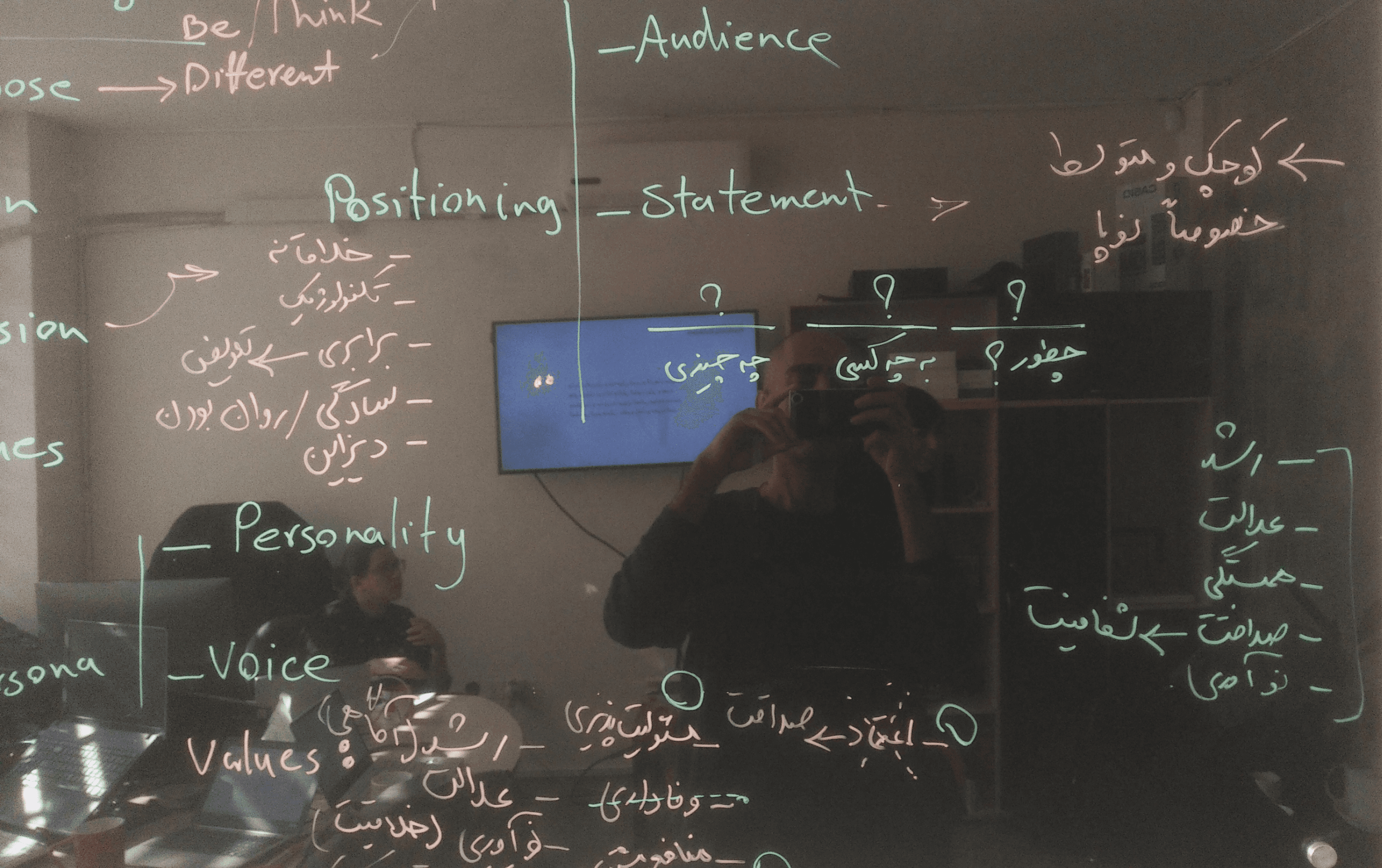
Brand strategy workshops
Competitors audit
Mood board creation
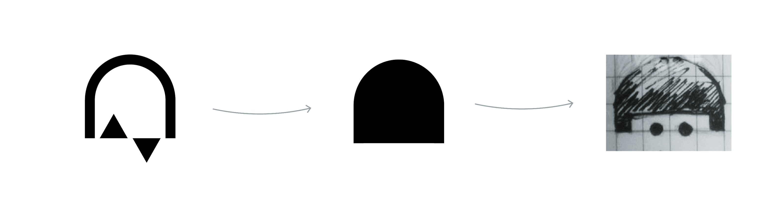
Logo design
Mobile UI design
Design System
Brand style guide
Process
Double diamond
I ran multiple strategy workshops with stakeholders, to clearly define brand core, positioning, and Identity.
This, later became the foundation for the visual language.
Competitor Audit
Then I did a comprehensive audit of the direct competitors. This was Important to make sure we are going to stand out among competition.

Design Strategy
There were some limitations, as well as new characteristics to be considered when thinking of any solution regarding the Ding’s new visual language.

Concept
I came up with different ideas and after sharing them with stakeholders, we decided to go with the following concept:


Prototype
Shift creation flow

